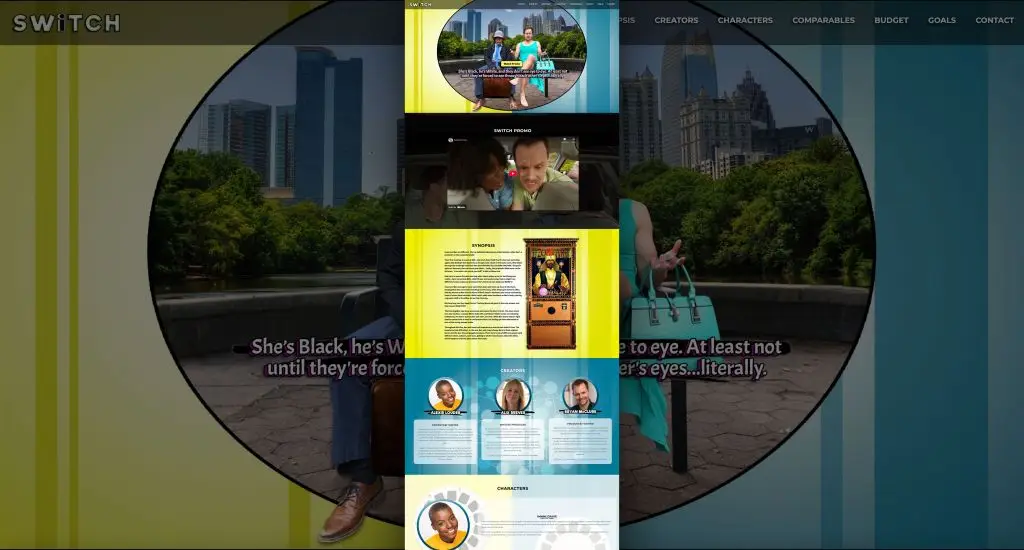
The Switch movie website was developed as a digital extension of the pitch deck, presenting the project to key industry stakeholders.
The assignment was clear: design a cinematic website that extends the Switch pitch deck.
We focused on clarity and credibility from the start. As a result, busy stakeholders can grasp the concept in minutes, feel the tone, and take the next step.
Switch is a playful body-swap rom-com. Therefore, the art direction uses bright, modern colors and a crisp grid. We pair bold type with generous spacing to spotlight the logline, stills, and key art. Meanwhile, light transitions echo the themes of contrast and blending.
Next, we shaped the information architecture around how decision-makers review projects. First comes a fast overview with the logline, hook, and one-sheet highlights. Then we offer deeper dives: synopsis, character bios, lookbook, budget breakdown and team credits.
On the technical side, the site is lean and fast. We compressed and properly sized images. In addition, the layout is fully responsive across phones, tablets, and deck screens. As a result, the viewer has a polished experience at home or on the go.
Finally, we guide action. Clear CTAs lead to the teaser and the deck/EPK, plus a streamlined contact path. Altogether, the site becomes a presentation-ready hub that elevates Switch, conveys its tone instantly, and produces intrigue and excitement.


